Article by guest blogger Doug Godinho
The role of a title designer for a film is a unique one. By the time you’re assigned to a project, it’s already mostly shot and you have to whittle the essence of a lengthy video experience into approximately 2 minutes of footage.
This is a role that Danny Yount knows very well and jokes that it’s only one level above caterers on a film set. Working at Prologue films, Danny is behind a large body of work that includes the titles sequences for “Tron: Legacy”, “6 Feet Under” and “Thor” to name a fraction of the total body of work.
In his presentation The Art of the Title Design, the first project he shared was the title sequence for the first Iron Man movie. He was given 3D models of the Iron Man suit from Industrial Light and Magic, but wanted to stay away from the 3D that was used throughout the movie – just because you can, doesn’t mean you should, as he puts it. He came up with the idea of using wireframes of the suit after seeing an animatic of the suit coming apart. Once one was made, he took it upon himself to show the evolution of the suit and the result is a great piece of work that shows considerable restraint while remaining visually stimulating.
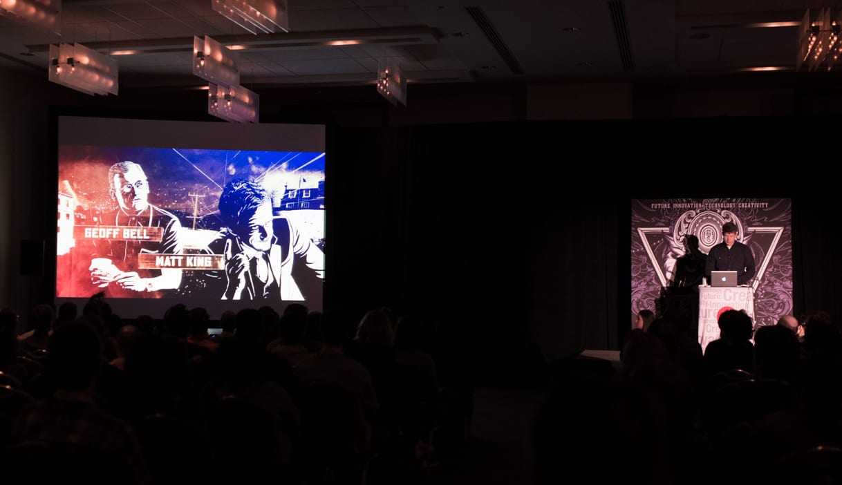
 For his next project, he worked with Guy Ritchie on the film RocknRolla. Using the aesthetic of street art, which Ritchie suggested, and some comic art, he created a highly stylized title sequence that set the tone for the rest of the movie and introduced key characters.
The next project he shared was the title credits for Sherlock Holmes: Game of Shadows – another collaboration with Guy Ritchie. The original idea was a chess-themed introduction, but was scrapped for a sequence that called back to the books of Arthur Conan Doyle, from which the main character is based on. They settled on an aesthetic of etchings of the characters that bridged the gap between the books and the film nicely.
The next two projects were Iron Man 2, where he was responsible for the user interface graphics used and the title sequence in Tron: Legacy. In both of these examples, there is a balance between the restraint of not overwhelming the audience while making something that is visually appealing.
His latest film titles design is for Oblivion, a recent science fiction film staring Tom Cruise. The film features intricate interface design as well as sweeping landscapes, which is something Danny paired beautifully in the opening titles.
Danny also worked on a design conference video for Semi-Permanent. The concept came from the idea that a lot of distance was travelled for everyone to be at the same place – he then simply mounted a camera to his car and went for a drive. After applying some interesting mirror effects, the images became more and more abstract and showing that a great title video doesn’t always need to have complex computer animation.
Danny ended his talk asking the audience how many people were students and a large part of the audience raised their hands. He responded by saying that he does these kinds of talks specifically for students, and the end of the talk was advice for students or less-experienced people that he titled “Rules to live by, though I often fail to do so it’s good to remind myself publically.”
1. Firstly, start anywhere. At first, no one knows what they are doing and that’s ok.
2. Use your own voice so no one will know you’re off key. Mimic and steal other people’s style because it’s how to develop your own.
3. Everything is communication, even when you’re not communicating. Even if you’re not aware that you’re communicating something, there is always something being communicated with design so; learn the language so you can communicate more effectively and be more conscious of what you’re communicating.
4. Don’t be afraid to do something so bad it makes people want to cry. Failing horribly is far better than repeating yourself or copying a fad.
5. Relax, it’s just design. You aren’t going to save the world – but you are making it more interesting. With that being said, overworking will affect your work, so don’t do it.
6. Do everything you can to not be late – clients hate that.
7. Get sleep and get a life. Know when to make time for important things besides design; it will make you work better. Balance is of the upmost importance.
8. See the world or at least USA or Mexico or something. The world affects our perspective so it’s a good idea to see some of it.
9. The best design doesn’t always win but you should always aim to do the best design you can. Don’t waste an opportunity
10. Being a demanding prima donna asshole designer doesn’t make you a better designer, but over time you will become a lonelier one. It’s not fair to push other people to work as hard as you are and it’s much more effective to inspire them to do better.
Finally, he ended with some tough love: it’s important to be humble and stay hungry. If you don’t have those qualities, do something else.