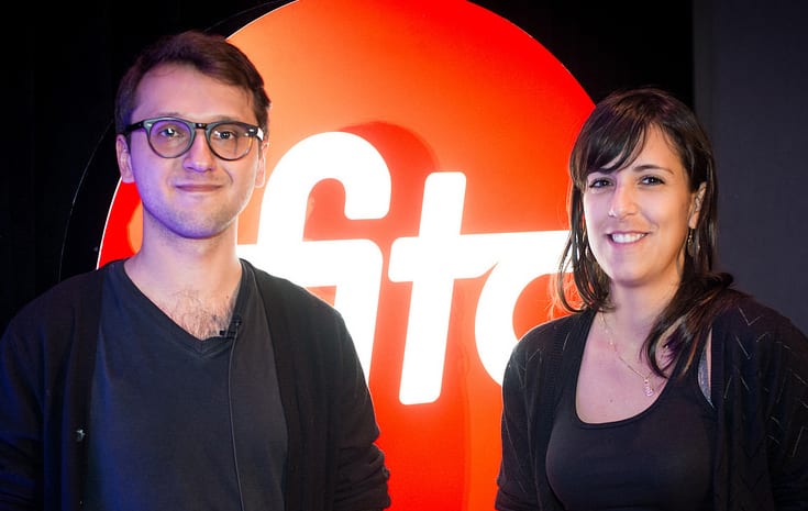
 UX Design has evolved over recent times from a ‘nice to have’ to a ‘must have’ process for any product or website to be successful. In their presentation Irene Pereyra and Anton Repponen took UX and design to the next level with a candid ‘behind the scenes’ look at redesigns of large content heavy websites. Their premise was to talk about, “finding new spaces within many hard restrictions.” Their professional goal is, “really try to do work that is practical and useful not just to promote a brand.”
Irene and Anton have traveled the globe over the past 12 years and showcased projects from Taiwan, Istanbul and The Bahamas. They broke down their process of tackling a project from start to finish and shared valuable insights along the way.
The Pitch
According to Irene, “pitching is like putting on make-up in the dark”. For one prospective client they worked tirelessly for 14 sleepless nights to put together a 200 page pitch that ultimately failed. In contrast, their last pitch include 4 attachments in one email with a price, that landed them the work.
Based on this experience (and many others) they suggest that the standard structure for a pitch include: an intro to summarize needs, artifacts, suggested new site structure, one concept (and a second concept if time permits) and finally a plan to handle responsive and mobile.
Irene didn’t pull any punches when she adamantly stated that she hates personas. She believes that personas don’t inform the design in anyway useful and that it is better to think about the reasons why people want to come to a site and map the content to meet those expectations. A thorough site audit brings clarity with the goal of cutting down the number of clicks.
Don’t be afraid to pitch crazy ideas as the customer will often reference those stand alone ideas even if they don’t go with them. And finally if you ever lose a pitch, always call the client and ask why.
Irene and Anton then walked us through the redesign of Wacom and their process for getting the work done once the pitch is won.
Discovery
Irene and Anton have some strict guidelines when it comes to developing a concept. They only brainstorm for one hour. Following this, they sketch out the concepts on paper and move the paper around to show how they want the concepts to work. This step takes only 2 hours. For the rest of the day they are at their computers collaborating by sending images and ideas back and forth.
Contrary to popular practice, they hate user research and find it to be, “a bunch of bullshit”. Their position is that everyone ends up manipulating the results to prove something to the client. Quoting Dieter Rams, “We never did any consumer research while we were at Braun because we wanted to change the world.”
This design team tries to map out all of the features before wireframing and the key is to have everything documented. Before they start designing they review the blueprint and estimate how long it will take to design all the features to get an idea of what the overall project will take.
While Irene works on the wireframes, Anton simultaneously works on the product page by setting up a grid with columns and modules. He likes to, “drag everything into one psd. - like a big unorganized puzzle. When you cannot fit everything, it informs you that you need interactivity.”
When presenting to the client they deliver a homepage and two product pages. Sometimes they are bang on and other times they find they go off on the wrong side and have to trash the entire project and start over.
Delivery
Once the client is onboard with the concept it is best to break down the work into batches. The UX designs should be organized by chunks of work and then bring in other designers and delegate. Irene feels that UX should help make some design decisions and include illustrations while still in the black and white phase rather than leaving all the hard work to the front-end designers.
They closed the presentation with a video of the finished product of Wacom and this advice. “Make the design more human and if you have an idea proactively do it, don’t wait to be asked.” With an unconventional approach to product design, Irene and Anton have found success.
 Michelle Caers (@mcaers) is the founder of DesignedUX, a user experience design firm in Toronto. She is a frequent speaker at technology, customer experience and education conferences and advises a number of start-ups on customer acquisition and product strategy. Linkedin